Market Intelligence
HVACR Map of the Month: The Replacement Market Has an Address
October 14, 2026 | 4 minute read
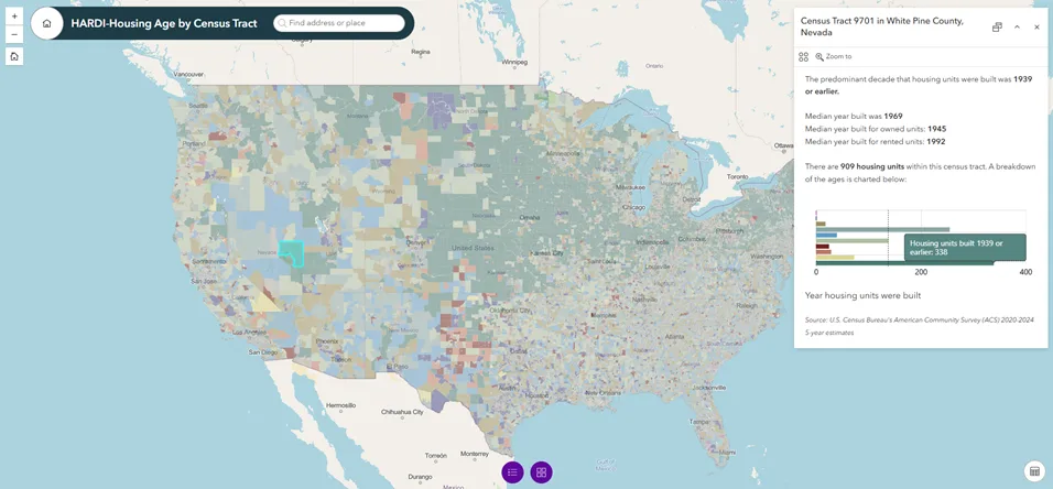
Welcome to Map of the Month, a new series from HARDI's Market Intelligence team. Each month we'll take a dataset we think members should be watching, put it into an interactive map and walk through what it shows. We're starting with housing age.
The national picture, briefly
In July, the Harvard Joint Center for Housing Studies published new analysis of HUD's 2023 American Housing Survey on how home improvement and repair spending changes as homes age. Two findings set up why this map matters. The housing stock is the oldest on record, with a median age of 44 years in 2023, up from 39 a decade earlier. And predictably, spending in older homes tilts toward work that's hard to defer: replacements of exterior and interior components, systems and equipment accounted for 39% of improvement and repair spending in pre-1960 homes, against 24% in homes built since 2010.
That's the national direction. It doesn't tell you where any of it is.
Why housing age belongs on a map
Age is one of the few housing characteristics reported for every census tract in the country, on the same definition, updated every year. There are roughly 85,000 tracts, averaging about 4,000 residents each — close enough to a neighborhood that the number means something, and far below the state and metro cuts most market planning runs on.
That resolution matters because housing age varies more inside a metro than between metros. A county-level average blends a 1920s core, a 1970s ring and a 2015 subdivision into one number that describes none of them. The decisions distributors make — where the next branch goes, how a territory gets drawn, which counter mix a given location carries, which contractors are worth the sales call — all happen well below the line where that average stops being useful.
Reading the map
Each tract is colored by its predominant build decade — the single decade that contributed the most housing units in that tract. Click any tract and the popup gives you the rest: total housing units, median year built broken out for owned and rented units, and a bar chart of unit counts by decade. The search bar takes an address, so you can go straight to a branch or a territory rather than hunting for it.
The color is a starting point, not a complete summary. A tract's leading decade might account for 40% of its units or 15%, and the map looks the same either way. Two things in the popup are worth a look before drawing conclusions from the color. The first is the median year built, which can land decades away from the leading category in tracts that built steadily over a long stretch. The second is the breakdown chart of housing units by build year. Hover your cursor over the bars in the chart to see the exact number of homes within the tract by build year.
The owned-versus-rented medians are worth a look too. They can sit a decade or more apart inside the same tract, which matters whenever the stock you care about is one or the other.
Read the color for the general pattern, the popup for the answer.
What we'd take from it
The unit counts are what make this operational rather than interesting. A tract can have old stock and almost no housing in it, and plenty do. Pairing the age profile with the count in the chart lets you weight a territory by how much aging stock is actually in it, instead of treating every dark tract as equivalent.
We’d treat all of it as a stock profile rather than a demand forecast. The ACS tells you what's standing and when it went up. It doesn't tell you what's been replaced since, what's being spent there now, or what's moving through the channel. It's the geographic layer underneath those questions, not an answer to them.
This is only part of the story.
Build year is one layer, and we can go a lot deeper — demographics, income, housing tenure, your own territories and branch footprint, layered together at the same resolution. GeoInsights is HARDI's new interactive mapping platform, built to put market geography in members' hands and customizable to what you actually need to see. If you want to explore these and other insights against your footprint, contact the Market Intelligence team.

Joey James
Senior Research Analyst
Joey James is a Senior Research Analyst on HARDI’s Market Intelligence team. He has over a decade of experience delivering data-driven insights across the public, private, and nonprofit sectors. He has worked in markets around the world, helping organizations make better decisions through market analysis, impact assessments, and forecasting. He is passionate about turning data into insights that drive growth and improve outcomes.